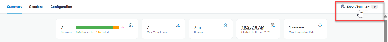
You can find a summary on a completed load test on the Test Report page under the Summary tab.
Outline
At the top of the report page, you can find an outline of the test results and general information on the test. The test status indicator represents the ratio of successfully executed test sessions to sessions with errors. To view failed sessions details, go to the Sessions tab and filter the session list by the Failed status.
Sharing Report
To send a PDF copy of the report summary to any specified email address, click Export Summary in the top-right corner of the report page and enter the desired recipient email (it does not need to belong to an account member). An email containing a download link will be sent to the provided email address.
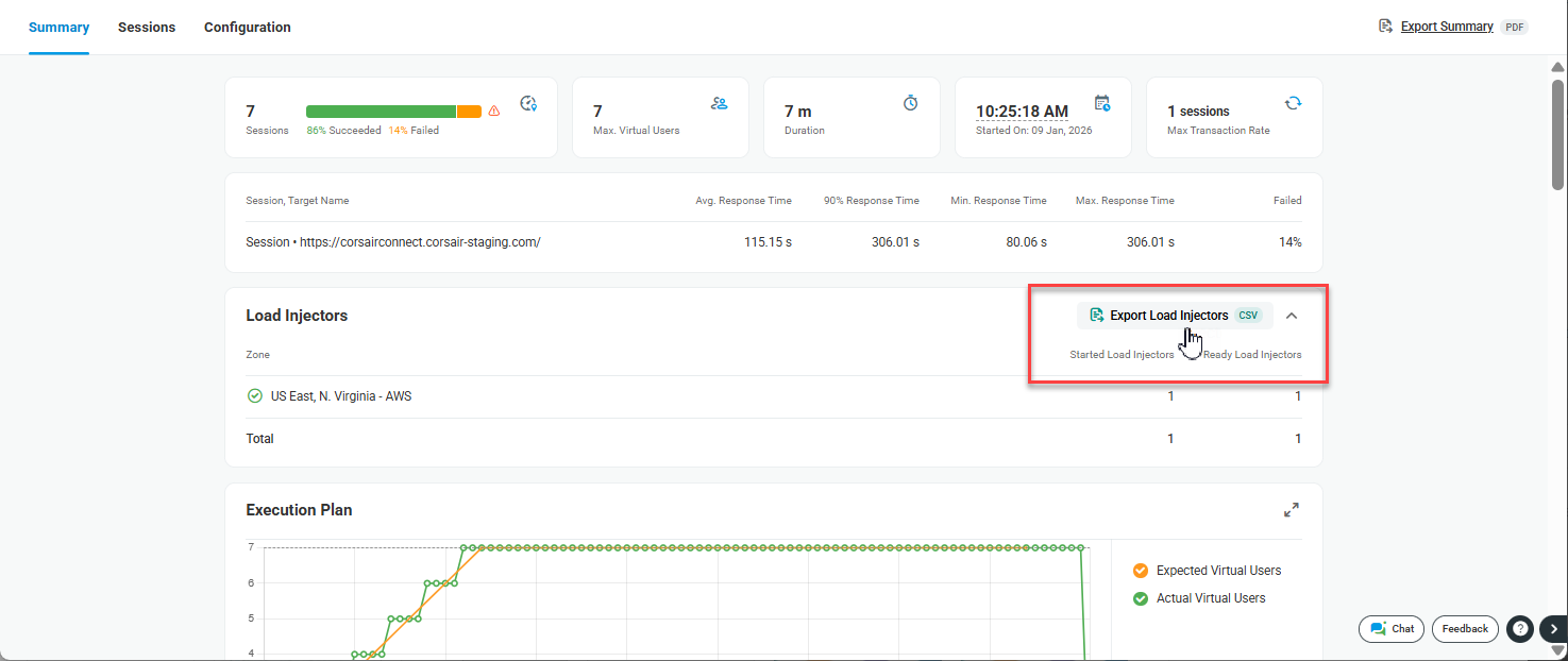
To download a CSV file listing the Load Injectors instantiated for the test along with their corresponding IP addresses, expand the Load Injectors report section and click Export Load Injectors. For more information, refer to Getting List of Load Injector IPs.
Charts overview
The vertical Y-axis on each chart represents test execution parameters, depending on the chart type. The horizontal X-axis shows the test duration time in minutes.
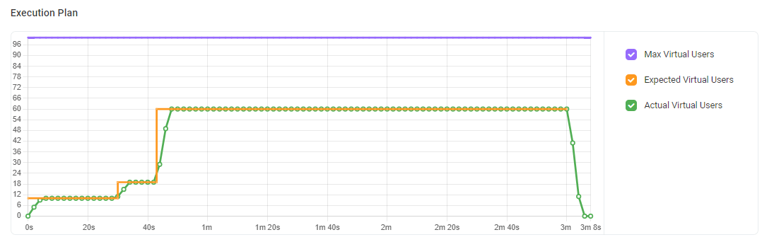
Execution plan
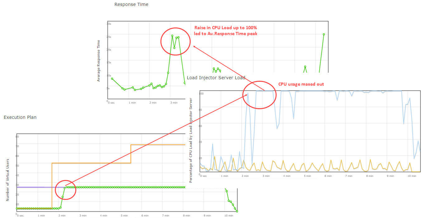
The line chart shows the change in the actual number of virtual users over the testing period vs. the expected number of virtual users based on the test scenario. You can view if the test execution plan, in terms of user load, was implemented successfully.
The Y-axis represents the number of virtual users.
The following lines are displayed on the chart:
- Max. Virtual Users – the predefined maximum number of virtual users that can be simulated at one time on the target resource.
- Actual Virtual Users – the number of users actually simulated on the target resource per time interval. Each node represents the total number of users simulated during a particular period. The first node represents the starting number of users.
- Expected Virtual Users – shows the predicted change in the number of users to reach the planned maximum load.
If the Actual Virtual Users line reaches the Max Virtual Users line, all virtual users allocated for the test were used and the site was tested under the planned maximum load. On the other hand, an issue takes place if there is a large deviation between these two lines, as shown in the picture below.
The most frequent reasons why the Max Virtual Users value was not reached are:
- LIs hit a CPU usage limit. Check the Load Injector Load chart in the test report.
- In the case of goal-based testing, Transaction Goal was reached with the fewer number of users than specified by Max Virtual Users. Check the Transactions per minute chart in the test report.
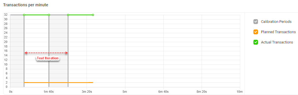
Transactions per minute (Goal-Based Load Test only)
The chart reflects goal vs. actual number of transactions per minute at each test iteration.
The Y-axis represents the number of transactions executed per minute on the target resource.
The chart shows the following lines:
- Transactions (Planned) – the planned number of transactions per minute set in the test scenario.
- Transactions (Actual) – the actual number of transactions simulated on the target website at each iteration. The line has gaps that indicate the calibration periods.
- Calibration periods – a time needed to reach the next level of load. Calibration periods are displayed as dimmed gaps between periods of actual load.
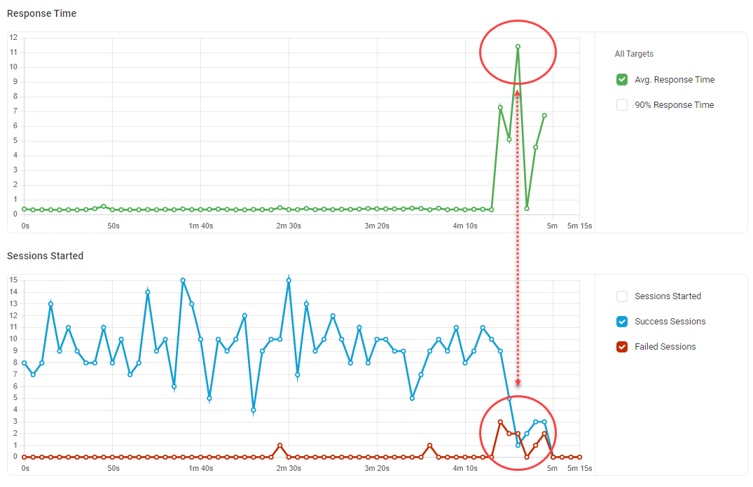
Response Time
The Response Time chart shows the change in the actual average duration of transactions and the associated 90th percentile.
The Y-axis represents the time in seconds. Each node on the chart represents the Response Time value calculated for the corresponding interval.
If there are no significant line fluctuations on the chart, your website handled the test load successfully.
If you have noticed a dramatic growth or decline in Response Time over the test or a sharp peak, check the other charts for details. For example, on the charts below, dramatic growth in Response Time caused by a progressive increase in the number of sessions with errors.
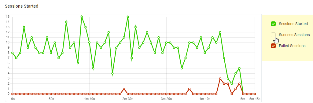
Session Statistics
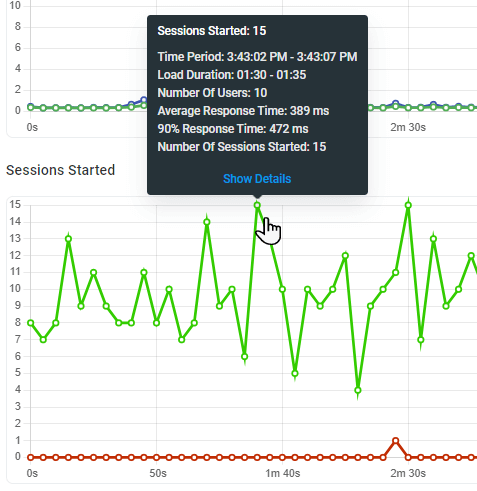
The Sessions Started chart allows comparing the total number of sessions started and the number of failed/successful sessions. The Y-axis shows the number of sessions.
A session includes a browser launch/shut down and a transaction by itself.
On the chart you can find the following lines:
- Sessions Started – the total number of sessions started at a particular time interval.
- Success Sessions – the number of sessions that were run without errors, i.e., all requests to test targets were executed successfully.
- Failed Sessions – the number of sessions with failures (no keywords/image found, failed to access the target resource, etc.).
- Uncompleted Sessions – the number of sessions that were aborted automatically at the end of the test duration time. For more details on this type of load test sessions, see the Uncompleted Sessions article of our Knowledge Base.
The Cumulative Sessions graph shows the total number of sessions started over the test. The chart allows LoadView users to assess the total number of virtual users simulated on the target resource over the test period. The Y-axis shows the number of sessions.
Each node represents the total count, calculated as a sum of sessions started by the time of calculation.
The Errors by Error Type dot chart illustrates the number of error sessions by error type. The number is specified on the Y-axis.
Use the chart to determine which error types predominated during a specific moment. Go to the Sessions tab to review failures. For error descriptions, check Error Codes.
Load Injector Load
The chart shows CPU load metrics received from Dotcom-Monitor LIs. Use it to assess how your test affects the performance of LIs running the test from different geographical zones.
Make sure LIs load levels are not higher than 80%. Based on our expertise, the optimal CPU load for the Load Injector Server machine is 80% or less. This load level excludes the server hardware delays that influence the server performance and slow down data processing.
If LIs CPU load exceeds 80%, it is recommended to decrease the Payload value and repeat the test. Otherwise, the test will keep showing inaccurate results.
On the other hand, if the CPU usage level is low, you can increase the payload per Load Injector and the maximum number of virtual users to use the LoadView resources optimally and minimize the cost.
Tips on Interpreting Results
All charts are synchronized with one another by the time axis, so vertical lines on the charts are aligned. Therefore, you can review the test execution history from chart to chart and see how the number of simulated users impacts the response time and LIs CPU load at a particular time period. In the example below, the LI was not able to generate requests and accept website answers fast enough because it simulated too many virtual users and CPU usage maxed out.
Nodes on the charts are active, so clicking a node will open its infotip. To see detailed information for the node-related sessions, click Show Details at the bottom of the infotip. Session reports for the selected time period will be displayed under the Sessions tab.
To facilitate a graph analysis and filter lines on it, use the switchers next to the graphs.