Your website isn’t performing optimally, and you don’t understand if it’s an issue with the size of your images, poor caching or if the sluggishness is caused by slow third-party or CDN content. It could even be caused by another factor altogether.
A waterfall chart, a form of data visualization that maps the cumulative effect of sequentially introduced values, can help. When tracking Web performance, a waterfall chart can help determine how long it takes for each action between the Web server and the user when a user accesses a website. This data can help website administrators understand how individual elements of a their sites are impacting performance.
Waterfall Charts Help Spot Performance Drags
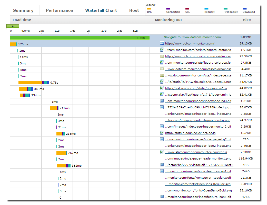
Waterfall charts are usually shown as bar graphs when tracking Web performance. As shown in the waterfall chart above, each row represents a different object within the page, such as text, an image or a JavaScript file. Each object makes its own roundtrip between the server and browser, and the time it takes to do so is captured in the waterfall chart, represented by a different colored bar for each activity. Times are measured for DNS lookup, Connection, SSL, Request, First Packet and Download as each object is delivered to the browser. Each activity is indicated in the legend at the bottom of the chart. Some activities are happening in parallel.
Let’s learn to read a waterfall chart by taking a look at each of these measurements, and how they can potentially impact website performance:
1) DNS lookup (orange) maps the time it takes for the browser to look up the domain of the object being requested. If times seem long, caching might be turned off or is not efficient. Developers can also use “keep-alives” to address this problem. Keep-alives allow you to test whether the TCP connection is still running or if it has broken.
2) Connection (purple) maps the time it takes for the browser and server to acknowledge that a connection between them exists. Limiting the number of connections by grouping them can help improve performance slightly.
3) SSL (red) maps the time it takes for the browser and server to “shake hands” before a connection is established, if the component is protected by SSL (public/private key encryption). If you use SSL, you can speed up performance by encrypting only essential elements, not every object.
4) Request (light blue) is the time it takes for the browser to send the request to the server.
5) First packet (blue green) is the time between when content is requested from a server, and when the first bit arrives back. Internet connection speeds can be an issue here; if a user is bandwidth constrained, this could impact performance. Your server-side code or database could also be causing performance problems.
6) Download (dark blue) is the time it takes for every piece of content to be sent from the server to the browser. Too much blue means there are either too many page objects or each object is too big. Compression, minification, more compact algorithms and eliminating redundancy can all help.
In the case of waterfall charts, less is always better. The fewer rows in the chart and the shorter each bar is, the better your website performance will be. Interested in seeing how the elements of your website are impacting performance? You can create a waterfall chart for your own website using this Website Speed Test tool from Dotcom-Monitor.

