Tag: waterfall chart

Page Load Speed

Optimizing Web Performance: Understanding Waterfall Charts

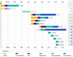
Waterfall charts are diagrams which represent how website resources are being downloaded, parsed by the engine, in a timeline that gives us the opportunity to see the sequence and dependencies between resources.  It assists in identifying where important events happened during the loading process. They can also let the user

Read More ⟩

Waterfall Chart: Data Visualization for Web Performance Analysis

A waterfall chart, a form of data visualization that maps the cumulative effect of sequentially introduced values, can help. When tracking Web performance, a waterfall chart can help determine how long it takes for each action between the Web server and the user when a user accesses a website. This data can help website administrators understand how individual elements of a their sites are impacting performance.

Read More ⟩

Recording Web Application Errors | Experience vs Perceived Experience

UserView Monitoring video is more than a perceived user experience metric, it is the most direct record of user experience performance in the web application monitoring market today. As a result, time and dollars can be invested targeting optimization efforts that you can see will improve your bottom line.

When web application errors occur, saving time, effectively communicating with your team, and seeing the web application error from the user’s view reduces the impact of the error and provides a more direct view of optimizing web applications for the future.

Read More ⟩

User Experience Monitoring in the Age of Video | User Experience Video

User Experience Video: Using Active Website Monitoring Video Capture

Is your website monitoring data so detailed its like watching a user experience video of website monitoring? If not, then its time to look at an industry-first innovation that tells the full story, website monitoring that captures a user experience video – rather than just data – about your website’s performance. See this user’s view yourself, in the aptly named UserView Monitoring.

Read More ⟩

Website Monitoring, Waterfall Charts, & Webpages of the Lycra-clad

An icon in the Twin Cities triathlon community, Jerry Bous, has a website problem that’s good to have. He has been able to parlay his love for the sport of triathlon into an occupation as THE triathlon race announcer as well as owner of the very popular and respected website www.MinnesotaTriNews.com.

But, the problem — similar to a triathlete who plateaus in their swim/bike/run speed at this point in the racing season — is that Jerry’s website may have recently “plateaued” in response time and in order to continue to improve is likely in need of some ongoing response time and performance monitoring.

Read More ⟩